Summary Insights (Federated Dashboards)
Use Summary Insights' Federated Dashboards to analyze trends within your connected data sources
The Query Federated Search Platform provides federated search capabilities via its Connectors and normalizes all data into the Query Data Model (QDM), based on the Open Cyber Security Framework (OCSF) data model. Not only are search results normalized into the QDM but search intent is captured such that searching for an Indicator of Compromise (IOC) or another fact in your data sources is done repeatably by translating to the exact query language or API method downstream.
However, to effectively use federated search your SOC analysts, threat hunters, Red Team operators, Purple Team operators, internal investigators, and/or detection engineers need to know where to start. Federated Dashboards within the Summary Insights view help you to orient on important facts within your data to provide a place to start a search or investigation, see common data points that appear across your Connectors, and provide a quick way to analyze a lot of security-relevant data in a quick manner.
How it Works
All Federated Dashboards -- and in the future other centralized information sources -- are available from Summary Insights. That page is automatically loaded when you login to Query or perform Single Sign-On (SSO) into the platform once you have onboarded and configured at least one Connector.
To navigate to Summary Insights manually, select the Summary Insights icon within the navigation menu as shown below (FIG. 1).
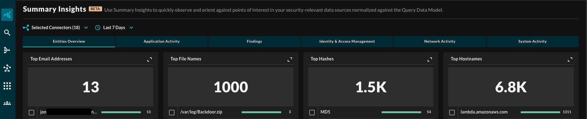
FIG. 1 - Summary Insights UI
Upon entering the dashboard, searches are immediately ran in the backend that correspond to a specific graph or visualization element. For instance, for the Top Email Addresses graphic, federated search queries are dispatched to all onboarded Connectors that provide email activity information or has Email Address as an available and searchable Entity.
If this was a SQL query it would look something like this: SELECT COUNT(email) FROM * WHERE date = TIMESTAMP '<your date range here>'.
The aggregations are processed client-side if they cannot be pushed down to the Connector's platform API or query interface itself, results are progressively yielded from these aggregations.
To make the queries more specific, you can change the Selected Platforms and/or the Time Picker, this allows you to run specific queries at specific dates (relative or absolute) against specific platforms, as shown below (FIG. 2).
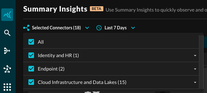
FIG. 2 - Platform and Time Picker
You cannot pause or stop these searches unless you leave the Summary Insights page. As the Query Federated Search Platform does not retain any data, each set of queries is ran independently from on another every time.
OCSF/QDM Category Filters
Within the OCSF data model (and QDM) every Event Class has a normalized Category that it belongs to, these thematically group similar Classes and is a filterable value. For more information, see the OCSF [base_event](https://schema.ocsf.io/1.2.0/classes/base_event?extensions=) object. As of OCSF 1.2 and QDM 1.2, the following Categories are available:
- System Activity
- Findings
- Identity & Access Management
- Network Activity
- Discovery
- Application Activity
The default filter tab Entities Overview presents all Entities without additional visualizations regardless of Category or Class, as shown above (FIG. 1).
Selecting a specific Category will filter Entity-specific visualizations down to the Classes that are part of the Category, and also show Event-specific visualizations which are detailed in the Event-based Dashboards section.
Top n Entities
These dashboards aggregate the total count of a given Entity per Connector(s), up to 2500 distinct values per Entity category can be aggregated, 5 are shown per page with a dynamically-sized horizontal bar chart relative to the total count of aggregations that is shown above the element. Each chart can be expanded or contracted using a toggle on the top-right, as shown below (FIG. 3).
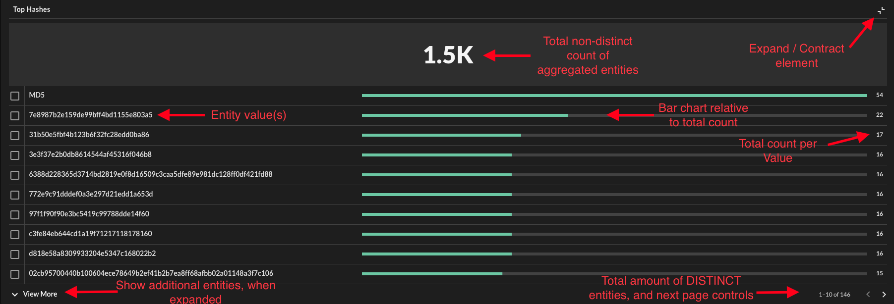
FIG. 3 - Expanded Entity chart descriptions
Entities are analogous to observables within the OCSF data model as well as the QDM. Over time, expect to see these continue to grow, they typically refer to Indicators (IP addresses, URLs, hashes) but also refer to "facts" about your own assets such as Resource IDs or MAC Addresses. The types of Entities supported by the Connectors differs from platform to platform.
Truncated values can be copy and pasted, or simply seen, by hovering over the value. This will be denoted by the presence of an ellipses (...), as shown below (FIG. 4).
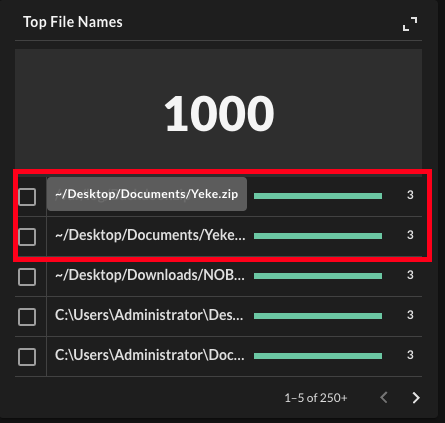
FIG. 4 - Hover-over truncated values
Additionally, when hovering over the total values near the page control, prompting you to expand the element to view them all in one stop as shown below (FIG. 5).
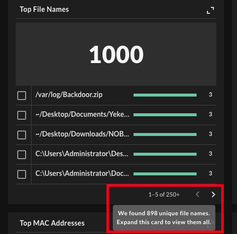
FIG. 5 - Hover-over on total distinct (unique) results
Pivot to Search from Dashboards
In every Entity-specific chart (Event-based pivoting coming soon), there are toggle-able checkboxes next to every value. Users can toggle these checkboxes and select the magnifying glass button that will immediately pivot you to a multi-value search for the specific Entity in the Federated Search UI, as shown below (FIG. 6).
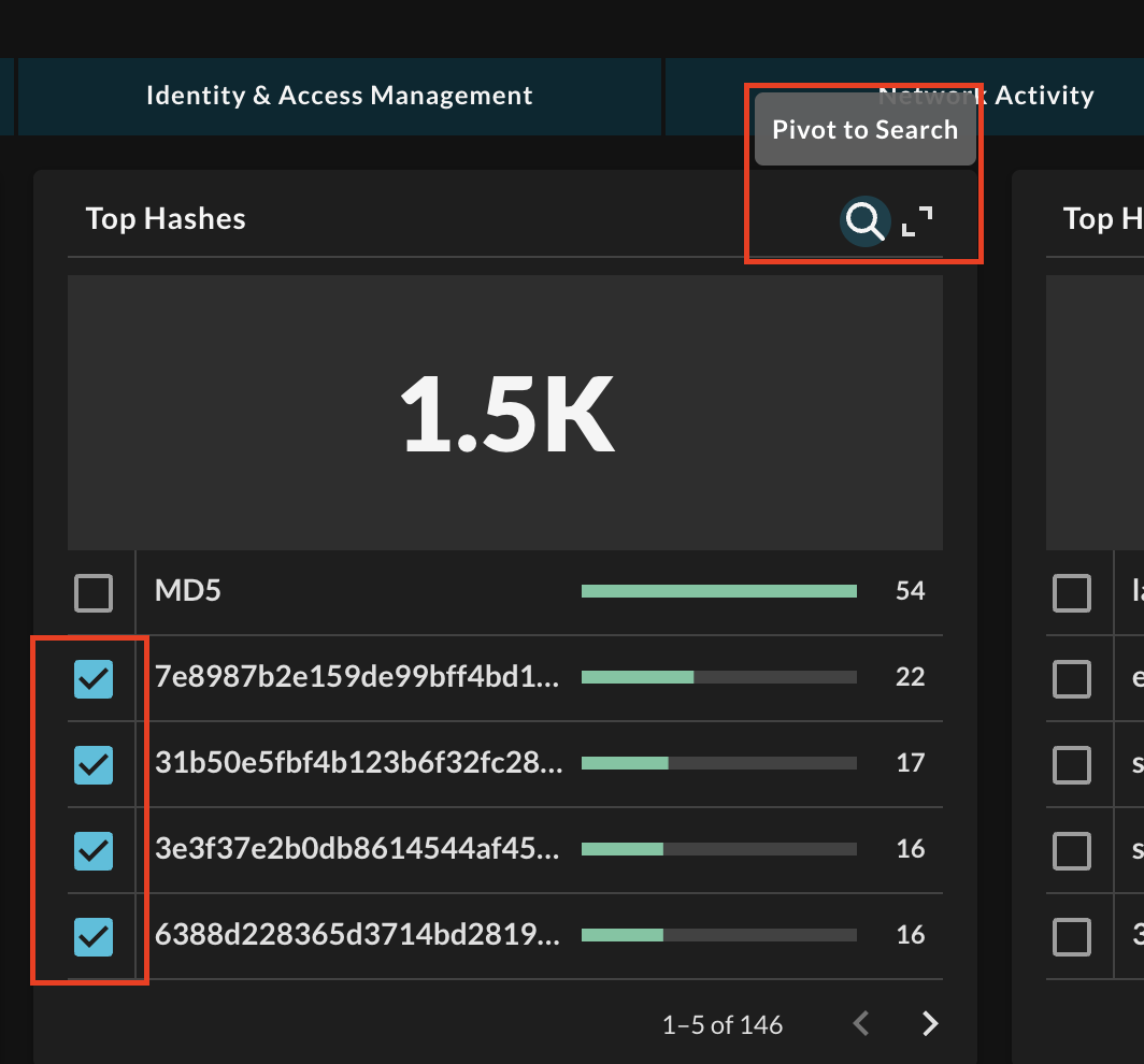
FIG. 6 - Pivoting to Federated Search from dashboard
Important Notes
- When pivoting to search, you will be unable to add additional Platforms if they were not selected to generate the aggregation.
- Only one Entity-type can be pivoted on at a time, multi-conditional searches are not yet enabled.
Event-based Dashboards
Within each Category tab, are Category-specific visualizations as well as Event-specific visualizations.
The basic Event-based visualization present in every view consist of the following, as also shown below (FIG. 7):
- Horizontal bar chart detailing the per-Class breakdown
- Horizontal bar chart detailing the normalized per-Severity breakdown
- Data grid containing per-Event details
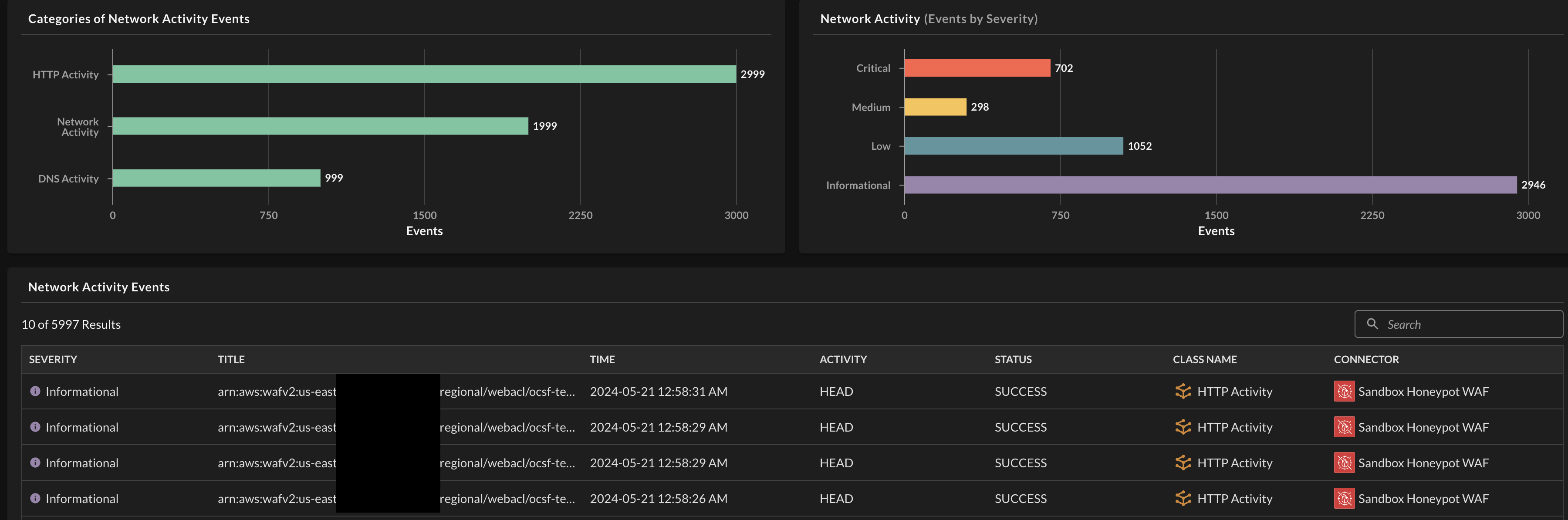
FIG. 7 - Basic Event-based visualizations
Each bar on the horizontal bar charts also acts as a filter on the aggregated data set. It will filter the partnered bar graph, along with the data grid and entity charts. Bars in the same chart will appear with a subdued color way and the bars on the other chart will disappear if not present in the filtered selection, as shown below (FIG. 8).
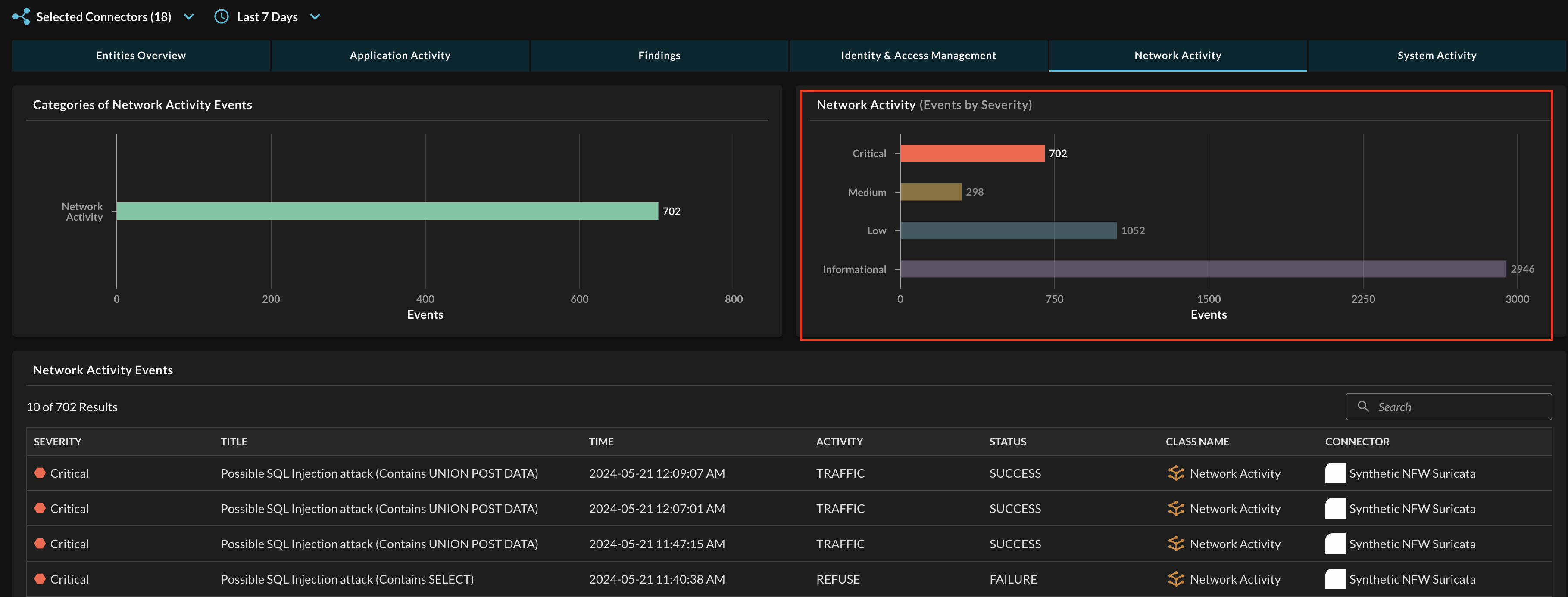
FIG. 8 - Interactive filtering on Entity-specific dashboards
The datagrid contains aggregated Events, which are normalized "happenings" that are mapped by Query Connectors -- both static and dynamic -- that cover different use cases such as network logs, EDR events, CSPM/CNAPP findings, and more. The columns are set based on shared standardized attributes within the OCSF events as long as highlighting the name of the Connector and showing the symbol of the upstream integration.
Important NoteIf there is a missing value within a column it means that the data was not mapped. If a static schema Connector has missing data please contact us at [email protected]. If a dynamic schema Connector data is missing, you have missed normalizing a column.
- Severity: Normalized from
severity_id, values normalized to Unknown, Other, Informational, Low, Medium, High, Critical, and Fatal. - Title: Normalized from
messageand for Findings category events, this is normalized fromfinding_info.title,finding_info.desc,finding.title, orfinding.descin that order ifmessageis blank. - Time: Normalized from
timeand converted to atimestamptype with UTC timezone. - Activity: Normalized from
activity_id, values are derived from the specific Event Class itself. - Status: Normalized from
status_id, values normalized to Unknown, Other, Success, and Failure. - Class Name: Normalized from
class_uidand set per connector. - Connector: The name of the Connector you provide during setup, the icon matches the product or architectural service icon of the upstream integration.
The search bar in the data grid is an experimental rich text feature that only searches across Severity, Title, Activity, and Status using a "starts with" string comparator. In the future, this entire data grid will have proper sorting and filtering for each column and the ability to pivot to search on Event-based searches.
Entity dashboards will have the same filters applied at the Category and Event level, such that selecting Network Activity and Critical will only display aggregated entities that match Critical Network Activity Events.
Updated about 1 year ago